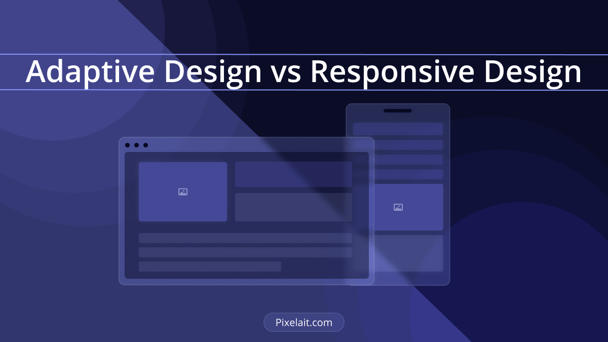

Introduction
In today’s digital landscape, the debate of adaptive vs. responsive design is more relevant than ever. As we delve into the world of web design, it’s essential to understand these two approaches for creating websites that not only look great but also function flawlessly on any device. This post aims to explore adaptive and responsive design, explaining their differences, advantages, and how they shape user experiences across diverse devices. Whether you’re a web designer, developer, or simply someone interested in the digital world, understanding adaptive vs. responsive design is key to tailoring UI for every device.
Understanding Adaptive Design
Adaptive design refers to a web design approach where a website is created to fit different screen sizes. Unlike responsive design, adaptive design involves designing multiple versions of a site for specific device sizes. When a user visits the website, the server detects the device being used and delivers the appropriate version of the site.
Advantages of Adaptive Design:
1. Tailored Experience: Adaptive design allows for a highly customized user experience as each version of the site can be specifically designed for a particular device.
2. Optimized Performance: Since each version is optimized for a specific device, websites can load faster, especially on mobile devices.
3. Control Over Design: Designers have more control over how the site appears on different devices, ensuring consistency in user experience.
A prime example of adaptive design is Amazon’s website. It offers different layouts for various devices, ensuring a tailored shopping experience whether you’re on a desktop, tablet, or smartphone.

Challenges of Adaptive Design:
1. Resource-Intensive: Creating multiple versions of a site requires more time and resources.
2. Maintenance: Updating the website means making changes across all versions, which can be cumbersome.
3. Device Detection Dependence: The effectiveness of adaptive design relies heavily on the accuracy of device detection.
Exploring Responsive Design
Responsive design is a more fluid approach. It enables a website to adapt its layout and content based on the screen size it’s being viewed on. This is achieved through flexible grid layouts, adaptable images, and CSS media queries.
Advantages of Responsive Design:
1. Flexibility: Websites automatically adjust to any screen size, offering a consistent experience across all devices.
2. Ease of Maintenance: Only one version of the website needs to be updated, simplifying the maintenance process.
3. SEO Benefits: Responsive design is favored by search engines like Google, aiding in better search rankings.
The Boston Globe’s website is an excellent illustration of responsive design. It adapts fluidly to different screen sizes, providing a consistent reading experience across desktops, tablets, and mobile phones.

Challenges of Responsive Design:
1. Design Limitations: The fluid nature of responsive design can limit creative freedom for designers.
2. Complex Coding: Implementing a responsive design can be more complex than adaptive, requiring advanced CSS and layout techniques.
3. Performance Issues: Without proper optimization, responsive sites can suffer from slower loading times on mobile devices.
Comparing Adaptive and Responsive Design
When comparing adaptive vs. responsive design, consider your project’s specific needs. Adaptive design offers a more tailored experience but requires more resources to build and maintain. Responsive design, on the other hand, provides flexibility and easier maintenance but might come with performance and design limitations. Dropbox’s website is a great instance of blending adaptive and responsive design elements. It combines the flexibility of responsive layout with adaptive elements for optimal performance across a variety of devices.

Key Considerations:
1. Audience and Device Usage: Understand your audience’s primary devices to determine the best approach.
2. Performance Goals: Consider the importance of load times and performance on various devices. Moreover, the effective use of whitespace is a critical aspect of both adaptive and responsive designs. Our article on The Power of Whitespace: Why Less Often Means More in UI delves into how strategic use of whitespace can enhance UI design, regardless of the approach you choose.
3. Resource Availability: Assess the resources and time available for development and maintenance.
Best Practices for Tailoring UI
Regardless of the approach you choose, following best practices is crucial for successful UI design:
1. User-Centric Design: Always prioritize user experience and ease of navigation.
2. Optimized Content: Ensure content is optimized for quick loading and relevance. Additionally, mastering typography is crucial for optimized content. Dive into our dedicated piece on Typography in UI: Mastering the Art of Readability for in-depth insights into making your UI texts as readable and user-friendly as possible.
3. Testing and Feedback: Regularly test the site on various devices and incorporate user feedback for improvements.
Conclusion
Adaptive vs. responsive design each have their strengths and challenges. The choice between them depends on your specific project requirements, resources, and audience needs. By understanding these approaches, you can effectively tailor UI for every device, ensuring a seamless user experience. Remember, the goal is to create websites that are not only visually appealing but also functional and accessible to all users, regardless of the device they use. To further understand the importance of UI in a business context, explore our post on How Good UI Affects Business: The Unseen Impact of User Interface Design, which highlights the significant, often subtle, impact of user interface design on business success.
In the world of web design, staying informed about adaptive vs. responsive design is crucial for creating interfaces that adapt seamlessly across various devices. Tailoring UI for every device involves understanding the nuances and applications of these approaches, ensuring optimal user experiences in the digital space.
