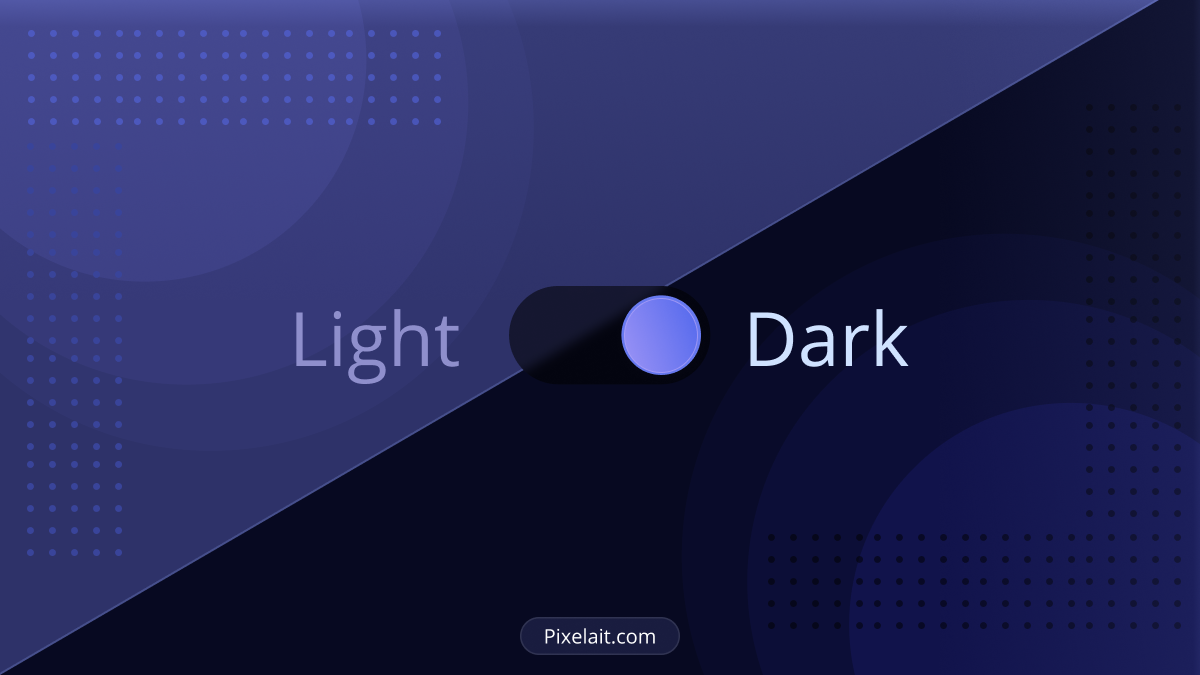

Introduction to Dark Mode in UI Design
In recent years, dark mode has become a staple in UI design across apps and operating systems. This design choice, favoring dark background hues, offers a stark contrast to traditional light themes. Its growing popularity stems from not only its visual appeal but also benefits like reduced eye strain and energy savings on specific screens. Implementing dark mode, however, goes beyond mere color inversion. It demands a deep understanding of color theory, accessibility, and user preferences. This guide will comprehensively cover the advantages of dark mode, the complexities of its implementation, and best practices for its integration into UI design. By the end, you’ll gain a complete understanding of how dark mode can improve user experience and how to effectively implement it.
The Benefits of Dark Mode in UI Design
Eye Comfort and Reduced Strain
One of the primary advantages of dark mode is its potential to offer greater comfort to users, especially in low-light environments. Traditional bright interfaces can be harsh on the eyes, especially when used for extended periods or in dimly lit settings. Dark mode’s reduced luminance creates a more comfortable viewing experience. The darker color palette minimizes the emission of blue light, which is known to cause eye strain and disrupt sleep patterns. This makes dark mode an ideal choice for users who spend considerable time on their devices, particularly during evening hours. To understand more about how blue light impacts your eyes, sleep, and overall health, a comprehensive overview provided by UC Davis Health offers valuable insights Read more about how blue light affects your eyes, sleep, and health.
Energy Efficiency and Extended Battery Life
Another significant benefit of dark mode, particularly on devices with OLED or AMOLED screens, is increased energy efficiency. These screen types can turn off pixels when displaying pure black, significantly reducing power consumption. As a result, using dark mode can lead to extended battery life in smartphones, tablets, and laptops. Beyond energy efficiency, accessibility is another critical aspect where technology can make a significant impact. Delve into our guide on How to Enhance Your Website’s Accessibility Using AI for comprehensive strategies on making your website more accessible with the help of AI. This aspect is particularly valuable in an era where device usage is incessant, and battery longevity is a key concern for users. For an in-depth exploration of whether dark mode can truly save energy and contribute positively to the environment, DoDonut provides an enlightening perspective Learn more about how Dark Mode can save energy and benefit the environment.
Aesthetic Appeal and User Preference
From an aesthetic standpoint, dark mode offers a sleek, modern look that many users find appealing. It provides a stylish alternative to the more traditional light backgrounds, and many users perceive it as a visually calming and less distracting interface option. The appeal of dark mode extends beyond its visual aesthetics; it’s also a matter of personal preference. Offering a dark mode option caters to diverse user preferences, allowing individuals to choose the interface style that suits them best. This flexibility can improve the overall user experience and satisfaction with the application or operating system. Moreover, the influence of UI on business success is substantial. You can explore more about this in our detailed discussion on How Good UI Affects Business: The Unseen Impact of User Interface Design.
Implementing Dark Mode in UI Design
Understanding Color Theory and Contrast
Effective implementation of dark mode is not as simple as replacing light backgrounds with dark ones. It requires a deep understanding of color theory and contrast. Designers must carefully select colors that maintain readability and accessibility in dark mode. This involves choosing text and background colors that offer enough contrast without being overly harsh. It’s essential to avoid using overly bright colors on dark backgrounds, as this can lead to visual vibration and discomfort. Designers should aim for a balanced color palette that maintains the integrity of the design while ensuring readability. For a deeper understanding of color dynamics in UI design, you might find our article on Mastering the Art of UI Color Palettes: Rules to Live particularly insightful.
Accessibility and Usability Considerations
When implementing dark mode, it’s crucial to prioritize accessibility and usability. Not all users find dark mode comfortable, and for some, particularly those with specific visual impairments, it can be less readable than light mode. Therefore, it’s important to provide users with the option to switch between dark and light modes easily. This choice allows users to select the mode that best suits their visual needs and preferences. Additionally, designers must ensure that all interface elements, such as buttons, links, and icons, are equally accessible and distinguishable in both modes.
Adapting Images and Media for Dark Mode
Incorporating images and other media in dark mode requires careful consideration. Images designed for light backgrounds may not look as intended in dark mode, leading to issues with visibility and overall aesthetic coherence. Designers should consider how images will appear in both modes and, if necessary, adjust them to ensure they are visually effective in dark mode. This might involve modifying brightness and contrast or providing alternative images specifically optimized for dark mode.
Best Practices for Dark Mode in UI Design

Consistency Across the Application
One key best practice in implementing dark mode is ensuring consistency across all parts of the application or website. This consistency involves maintaining a uniform color palette, ensuring that all elements are clearly visible, and preserving the overall look and feel of the design. Consistency helps in creating a cohesive user experience, regardless of which mode the user prefers.
Testing and User Feedback
Thorough testing is essential to ensure that dark mode implementation is successful. This testing should include assessing the mode in various lighting conditions and on different devices. It’s also important to gather user feedback to understand how the dark mode is being received and identify areas for improvement. User feedback can provide valuable insights into preferences and usability issues that may not be immediately apparent to designers.
Dynamic Switching and System Preferences
Ideally, dark mode implementation should include dynamic switching capabilities, allowing the interface to automatically adjust based on user preferences or system settings. Many operating systems now offer system-wide dark mode settings, and applications can be designed to automatically align with these preferences. This feature enhances the user experience by providing a seamless transition between modes based on the user’s current environment or time of day.
Conclusion
Dark mode is more than just a trend in UI design; it’s a feature that offers real benefits in terms of visual comfort, energy efficiency, and aesthetic appeal. However, its effective implementation requires careful consideration of color theory, accessibility, and user preferences. By following best practices and focusing on creating a balanced, user-friendly experience, designers can successfully integrate dark mode into their UI designs, offering users a comfortable and customizable interface option. As technology and user needs continue to evolve, dark mode will likely remain a significant aspect of UI design, emphasizing the importance of adaptable and user-centric design approaches.