INTRODUCTION
When designing a website, ensuring that your color choices protect users’ eyes is important. With the rise of screen time, eye strain has become a common issue, especially when staring at bright or contrasting colors for too long. Here’s how you can make sure your website colors are easy on the eyes and still visually appealing.
1. Protect Users’ Eyes from Bright Screens
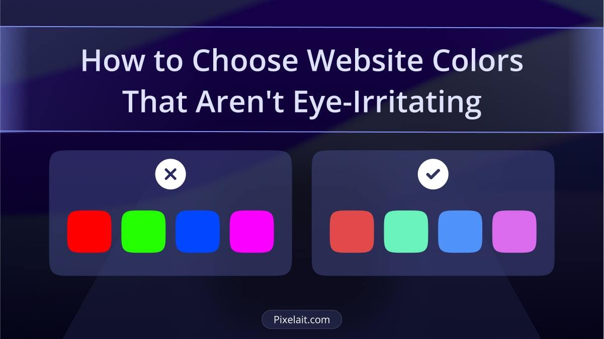
Bright colors can be visually impressive but overwhelming if not used correctly. when a color is both highly saturated (which means it’s very intense) and very bright (meaning it’s filled with light), it can actually be uncomfortable to look at for too long. Think of neon yellow or a vivid red; they might catch your attention, but they can also make your eyes feel tired quickly. This happens because of something called color contrast. When two colors are very different, like black text on a neon background, the contrast can be so strong that it’s hard to focus on the text. This is why choosing colors with the right color ratio is crucial. You want your website to be easy to read and pleasant to look at, which means finding the right balance between colors.
Another key aspect is luminosity, or how much light a color reflects. Bright, eye-catching colors often have high luminosity, which can be overwhelming in large doses. Instead of using these bright colors everywhere, it’s better to mix them with softer, more muted hues. This way, your site remains engaging without straining your visitors’ eyes.Bright colors can be visually impressive but overwhelming if not used correctly. Consider using luminance colors carefully. If you want to understand how to generate stunning designs using colors, check out our blog post on UI Color Palette Metrics: A Guide to Generating Stunning Designs.
2. Balance White and Black
White has 100% color brightness, while black has 0%. This stark contrast can create intense light levels that overstimulate the eyes. For extended reading, avoid pure black text on pure white backgrounds. When it comes to reading for extended periods on a screen, pure black text on a pure white background might seem like the obvious choice because it’s high contrast. However, this combination can actually cause eye strain over time.
The stark contrast between pure black and pure white creates a sharp distinction that can be too harsh for our eyes. When you stare at this high-contrast combination for too long, it forces your eyes to work harder, leading to fatigue. This is especially true when reading large blocks of text on a website or an app.
A softer approach is to use a dark gray for text instead of pure black, paired with an off-white or light gray background. This reduces the intensity of the contrast, making the reading experience more comfortable. The slight reduction in contrast helps the eyes to glide over the text more easily, reducing strain and allowing users to read for longer without discomfort.
Additionally, this choice of colors improves the overall visual harmony of your website. It makes your content feel more welcoming and less clinical, enhancing user engagement. By paying attention to color contrast and making subtle adjustments, you can create a reading environment that is both aesthetically pleasing and easy on the eyes.
If you’re interested in learning why whitespace is important in UI, our article The Power of Whitespace in UI: Why Less Often Means More? might be just what you need.
3. Mind the Color Contrast
High color contrast is essential for readability, but it doesn’t always have to be extreme. Designers should consider the shade of black they use. For those focused on dark themes, our blog post on Dark Mode in UI Design: Benefits and Best Practices covers how to handle these contrasts effectively.
If you’re working with Figma, you can check contrast easily with Pixelait’s Contrast Checker to ensure your design meets the necessary standards. Color contrast ratio is a measure of how different two colors are when placed next to each other, like the text and background on a website. It’s important because it affects how easily someone can read the text. A higher contrast ratio means the text stands out more clearly against the background, making it easier to read. For example, dark text on a light background usually has a good contrast ratio.When the contrast ratio is too low, like light gray text on a white background, it becomes harder to see the text, causing strain on the eyes. On the other hand, if the ratio is too high, like pure black text on a pure white background, it can be too intense, also leading to eye strain. Finding the right balance with your color contrast ratio ensures that your content is readable and comfortable to look at.

4. Consider the Dark Theme
Dark themes have become increasingly popular, with many users preferring them for apps and websites. However, it’s important to strike a balance. A survey revealed that 58% of adults in the U.S. have experienced eye strain from prolonged computer use.
A good example of a dark mode color scheme designed by Jordan Hughes.

5. Test and Adjust
Before finalizing your color palette, test it in different lighting conditions and on various screens. The goal is to ensure that your design is comfortable for extended viewing sessions. For more tips on mastering color palettes, don’t miss our blog post on Mastering the Art of UI Color Palettes: Rules to Live By.
Conclusion
Choosing the right colors for your website goes beyond aesthetics; it’s about creating a comfortable experience for your users. By following these tips, you can craft a color scheme that reduces eye strain and keeps visitors engaged.
