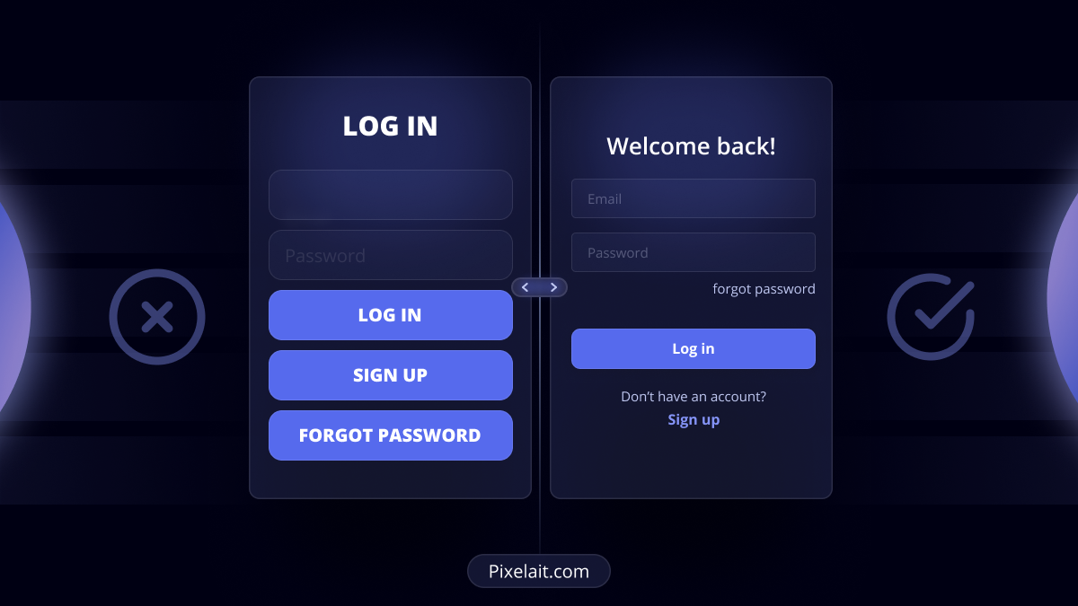
Inroduction
Step into a clean, contemporary store where items are organized perfectly, directions are evident, and your needs are met instantly. This experience mirrors the essence of good User Interface (UI) design. In today’s digital age, the significance of good UI is often underestimated, yet it remains pivotal in determining a digital project’s success. Join us in exploring the substantial business influence of good UI.
The Business Impact of Good UI
- Increased User Engagement: Consider your go-to app. Its intuitive nature draws you in, doesn’t it? Expert UI is like an invisible guide for users, ensuring a seamless experience. When users are at ease, they stay longer, enhancing retention and visit frequency.
- Boosted Conversions: Ever breezed through an online transaction? That’s proficient UI at work. When processes are straightforward, users are prompted to act, be it subscribing or shopping.
- Enhanced Brand Image: Stellar UI is akin to giving your brand a high-end makeover. It not only uplifts functionality but also exudes positivity, signaling a brand’s commitment to user satisfaction.
Consequences of Bad UI
- Reduced User Trust: Think of a questionable website where you hesitated to share payment details. This is the distrust that subpar UI can breed, causing users to question the brand.
- Increased Bounce Rates: Left a confusing website midway? Complex UI pushes users away, escalating bounce rates and diminishing potential revenue.
- Wasted Resources: Consistently patching a flawed system? Poor UI is similar – it necessitates frequent fixes, sapping funds and morale.
What Makes UI Good?
Simplicity: Less is more. A streamlined design clears the screen and centers user attention, easing navigation.
Consistency: Visualize having varied handles for each door at home – perplexing, right? Uniform UI elements like buttons or colors enhance usability. Dive deeper into the importance of colors with our post on Mastering the Art of UI Color Palettes: Rules to Live By.
Feedback: Consider the faint glow when a button is clicked. Immediate responses are like silent affirmations, confirming users’ actions.
User-Centric Design: Felt an application was tailor-made for you? Prioritizing the target audience in design evokes such sentiments.
Championing Readability in UI
Font Choice: Fonts frame your content. Legible fonts like Roboto and Helvetica ensure consistent interpretation. Dive into font nuances with our guide on Typography in UI: Mastering the Art of Readability.
Contrast: Proper contrast prevents text from fading into backgrounds, aiding seamless reading. AI tools, like our readability checker, can offer crucial contrast insights. Further explore readability fundamentals here.
Line Length: Retain user focus by maintaining line lengths between 50-75 characters.
Hierarchy: Akin to a structured book, UI should employ varied font dimensions, charting an easy navigation path for users. Grasp spacing nuances in our piece on Spacing Systems in UI Design: The Unsung Hero of Layout Consistency.
Conclusion
In the vast digital cosmos, UI transcends mere aesthetics. It silently personifies your brand. By prioritizing UI design and emphasizing readability, businesses can forge stronger connections with their audience, heralding unmatched digital success. Dedicating effort to refine UI design amplifies user faith and business growth – a tactical decision that sets brands apart in the digital domain.
