Introduction
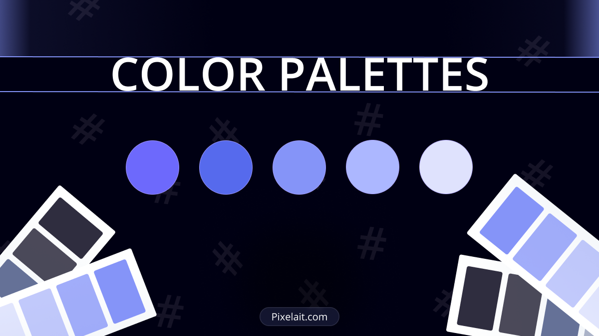
Colors are the silent storytellers of the digital realm. They influence our moods, guide our gaze, and evoke emotions we might not even be aware of. In the vast spectrum of UI design, color palettes aren’t just about aesthetics; they’re pivotal for functional harmony and brand resonance. As we’ve previously explored in How Good UI Affects Business: The Unseen Impact of User Interface Design, the visual and functional aspects of UI are deeply intertwined. Let’s embark on a vibrant journey and discover the rules that underpin memorable and effective UI color palettes.
1. Understand the Basics of Color Theory
Before diving deep into the UI realm, it’s crucial to grasp the fundamentals. Remember ROYGBIV from art class? This mnemonic for the sequence of hues in a rainbow (red, orange, yellow, green, blue, indigo, violet) lays the groundwork for understanding color relationships. Complementary, analogous, and triadic are just a few relationships that can define a balanced and engaging UI palette.
2. Prioritize Function Over Beauty
While a captivating palette might draw users in, if it hinders usability, it’s missing the mark.As we’ve discussed in the importance of Spacing Systems in UI Design: The Unsung Hero of Layout Consistency, functional design elements, including color, work cohesively to enhance user experience. Colors in UI should serve clear functions—highlighting, signaling, distinguishing. For instance, red might signify an error or critical action, while green often represents success or progress.
3. Embrace the 60-30-10 Rule
This tried-and-true design principle advises that you use 60% of a dominant color, 30% of a secondary color, and 10% of an accent color. This distribution ensures a balanced and harmonious look, preventing visual overwhelm while still allowing for vibrant accents.
4. Mind the Contrast
Especially for text elements! High contrast ensures readability and accessibility. A tool like a contrast checker can be invaluable. Remember, your design should be inclusive, catering to users with visual impairments or color blindness. Read more about text readability here.
5. Stay True to the Brand
Your color choices should resonate with the brand’s identity and values. If the brand exudes calm and tranquility, a palette bursting with neon might be a mismatch. Consistency across platforms reinforces brand identity and fosters trust.
6. Test Across Devices & Lighting Conditions
What looks splendid on a studio monitor might appear washed out on a mobile device under bright sunlight. Ensure your palette retains its charm and functionality across diverse viewing conditions.
7. Keep it Limited
While the spectrum of colors is vast, your UI palette should be restrained. Too many colors can confuse users and dilute brand identity. A focused palette is often more powerful and versatile.
8. Evolve and Adapt
Design is dynamic. While it’s essential to have guidelines and consistency, don’t be afraid to adapt and evolve your palette as user needs, brand directions, or global trends shift.
Conclusion
Colors are the heartbeat of UI design, setting its tone, and defining its essence. As designers, we wield the brush that paints digital canvases. By embracing these rules, we’re not just crafting pleasing visuals; we’re curating experiences, evoking emotions, and guiding journeys. So, next time you pick a shade, remember the weight it carries and the stories it can unfurl. In the realm of UI, every hue matters, and every palette tells a tale.
