Introduction
You’ve likely heard the saying, “It’s not just what you say, but how you say it.” In the realm of UI design, we can tweak this adage a bit: “It’s not just what you display, but how you space it.”Design system spacing is essential in achieving this, as it provides a structured approach to the placement and alignment of elements. As we discussed in How Good UI Affects Business: The Unseen Impact of User Interface Design, the effectiveness of UI is multifaceted. The precision of spacing can make or break the user’s experience. Welcome to the fascinating world of spacing systems in UI design—a key player ensuring that our digital experiences feel harmonious and intentional. Let’s dive deeper into why maintaining consistency in spacing is paramount for top-notch user interfaces.
1. The Essence of Spacing in UI Design
At first glance, spaces might seem like mere gaps, but they’re far more influential. This aligns with the principles we touched upon in Decoding Digital Design: The 5 Must-Have Pillars of Readable UI Texts. Spacing gives design elements room to breathe, enabling users to distinguish between separate components, ensuring a visual rhythm, and offering clarity. It’s akin to the pauses between musical notes, adding rhythm and harmony to a composition.
2. Why Consistency is King
Imagine reading a book where the gap between lines or paragraphs is erratic. Confusing, isn’t it? Similarly, inconsistent spacing in UI design can feel jarring and unsettling. This idea of consistency is also present in how we use colors, as explored in Mastering the Art of UI Color Palettes: Rules to Live By. Consistent spacing offers predictability, guiding users with a recognizable layout. Users subconsciously recognize patterns, making navigation intuitive. It’s like having a familiar friend guide you, offering a sense of comfort and reliability.
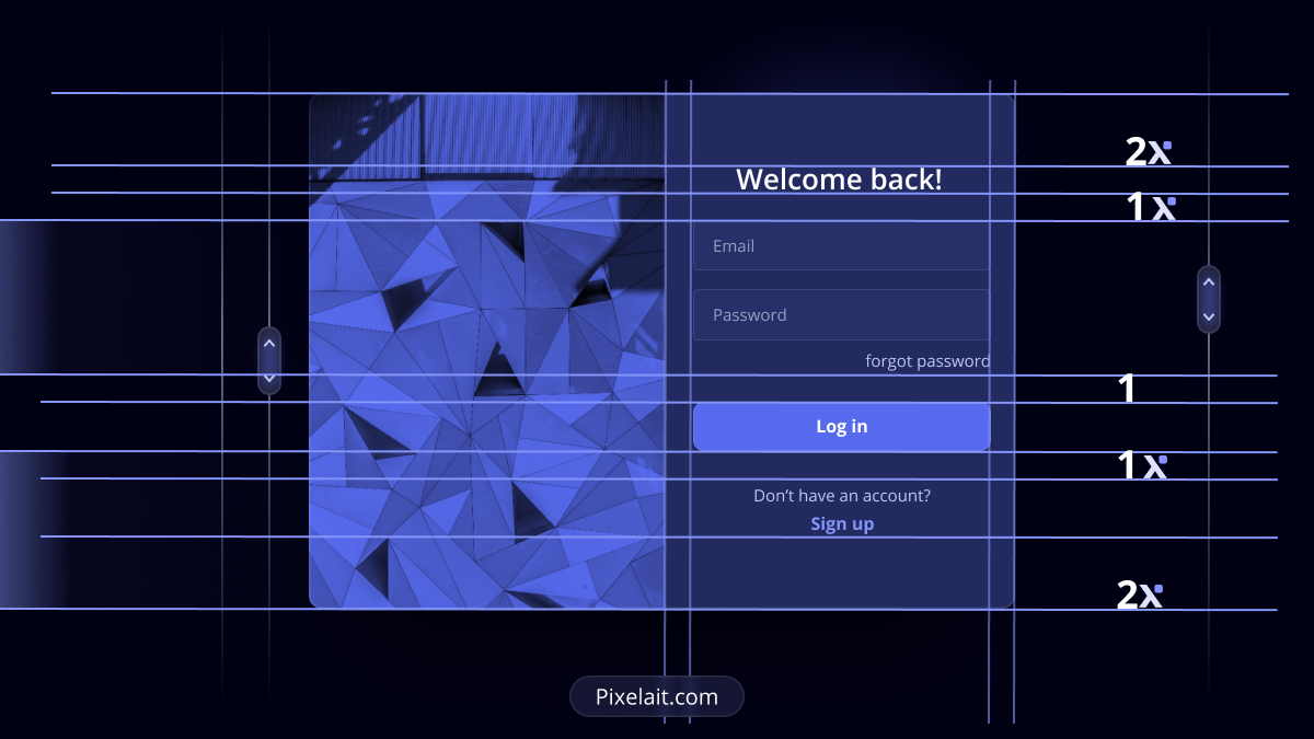
3. Implementing a Modular Spacing System
One proven approach is adopting a modular spacing system, often based on the powers of 2 (4px, 8px, 16px, etc.) or 8-pixel grid systems. This offers a versatile yet consistent method to allocate space. For instance, using a base unit of 8px for margin and padding can make scaling design elements seamless, ensuring proportionality across different screen sizes. Adopting such systems also fosters cohesion within design teams, ensuring everyone is on the same page.
4. Benefits Beyond Aesthetics
Beyond making things look good, consistent spacing can enhance usability. By giving elements ample space, we reduce the risk of misclicks, especially on mobile devices. Furthermore, a standardized spacing system can speed up the design and development process. Designers have clear guidelines, and developers can implement faster, reducing potential misinterpretations.
5. Tools & Techniques
There are myriad tools to aid designers in maintaining spacing consistency. Software like Sketch, Figma, and Adobe XD offer grid and layout functionalities. Additionally, plugins like “Spacer” for Sketch can automate spacing, ensuring pixel-perfect consistency. Always remember: the tool is only as good as its user. It’s essential to understand the underlying principles of spacing before relying solely on tools.
Conclusion
As we wrap up our exploration of spacing systems in UI design, it’s clear that these unsung heroes play a pivotal role. They offer the scaffolding upon which great designs are built. A consistent approach to spacing lays the foundation for intuitive user engagement. By ensuring spacing consistency, we’re not just beautifying the design; we’re enhancing user experience, streamlining the design process, and creating digital spaces that resonate with familiarity and ease. Next time you admire a digital platform, remember the invisible hand of consistent spacing, working tirelessly behind the scenes, orchestrating the visual symphony!

