Introduction
UI color palette metrics аre game-changers in the world of digital design. This guide dives into how these metrics can be utilized to craft stunning designs that not only fascinate but also engage users effectively. By discovering the modest yet deep impact of color in user interface (UI) design, we can advance our projects from good to excellent, making them stand out in the crowded digital space.
Section 1: The Importance of Color in UI Design
Color wields incredible influence over our perceptions, emotions, and interactions with digital interfaces. It goes beyond aesthetics; color can affect usability, user experience, and even conversion rates. Understanding the psychology behind color choices and their impact on user engagement is the first step in leveraging UI color palette metrics effectively.
After exploring the psychological impact of color in UI design, take a look at Adobe Color. This tool exemplifies the application of color theory, allowing users to create and explore color schemes with ease, demonstrating the practical side of our discussion with an interactive and user-friendly interface. For insights into harnessing the power of dark mode in UI design, delve into our article on Dark Mode in UI Design: Benefits and Best Practices.

Section 2: Understanding UI Color Palette Metrics
Diving deeper, UI color palette metrics such as hue, saturation, brightness, and contrast are important tools in a designer’s arsenal. These metrics help in creating a harmonious color palette that improves readability guides user attention, and contributes to the overall user experience.
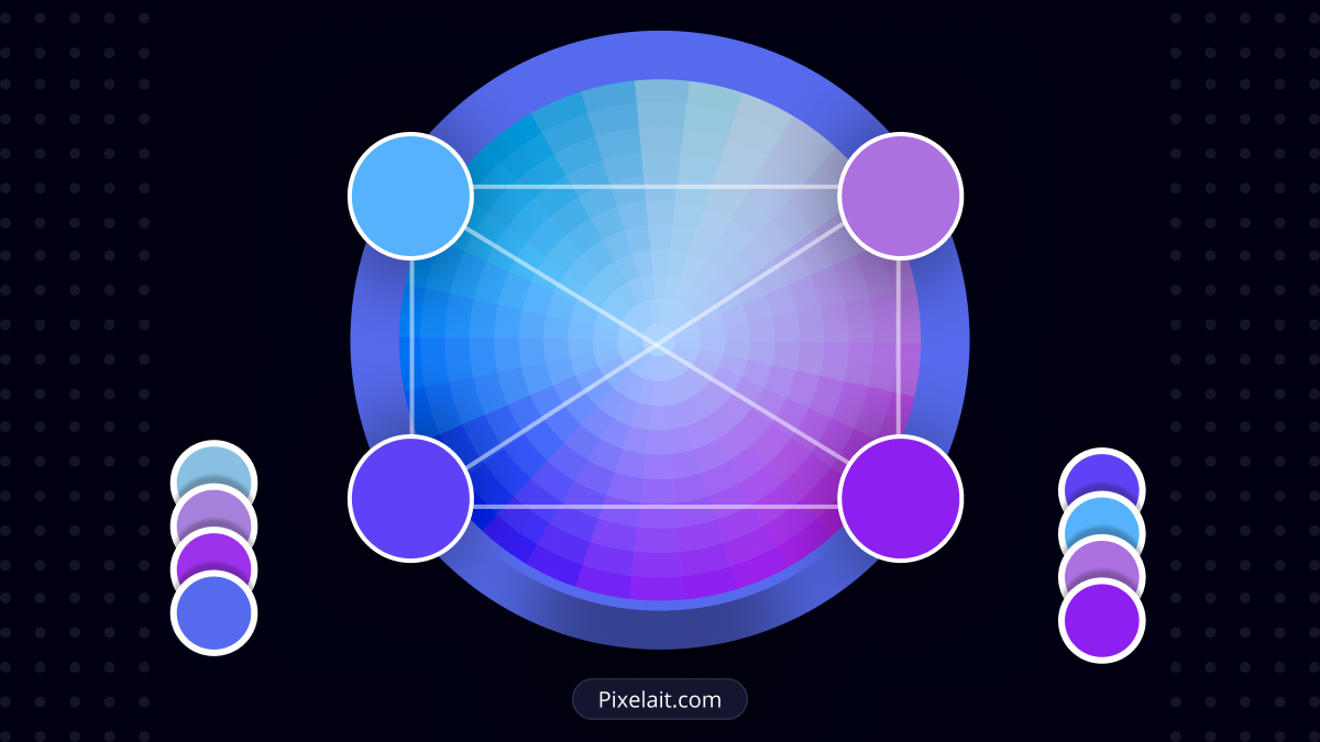
When it comes to color combinations, several methodologies can be applied across various fields such as design, art, and fashion. These methodologies often rely on color theory, which is the study of how colors interact with each other and the effects they have on the viewer. Here are some of the most common methodologies:
Color Wheel-Based Methods:
- Complementary Colors: Colors opposite each other on the color wheel. This combination offers high contrast and high visibility, making it very appealing.

- Analogous Colors: Colors that are next to each other on the color wheel. These create a harmonious and serene look due to their close relation.

- Triadic Colors: A combination of colors that are evenly spaced around the color wheel. This method offers a vibrant look even if you use pale or unsaturated versions of your hues.

- Split-Complementary Colors: A variation of the complementary scheme, including the base color and the two colors adjacent to its complementary color. This provides high contrast with less tension than the complementary scheme.

- Tetradic (Double Complementary) Colors: Uses four colors together, in the form of two complementary color pairs. This scheme offers plenty of possibilities in color variation and produces a rich color palette.

Warm and Cool Colors:
- Warm Colors: Include reds, oranges, and yellows; these colors are energetic, optimistic, and can be used to grab attention.

- Cool Colors: Include blues, greens, and purples; known for their calming and soothing effects.
Monochromatic Scheme:
- Involves using various shades, tints, and saturations of a single color. This creates a cohesive and elegant look, offering a sense of visual harmony and simplicity.

Achromatic Scheme:
- Utilizes black, white, and grays. This scheme is often used for creating minimalist designs, emphasizing texture and form without the influence of color.

Nature-Inspired Color Schemes:
- These are derived from natural landscapes and organisms, offering a palette that’s inherently harmonious to human eyes. Examples include forest greens, ocean blues, sunset oranges, and earthy browns.

Cultural and Contextual Methodologies:
- Colors carry different meanings and associations in various cultures. Understanding the cultural context can guide the color combination process, ensuring appropriateness and resonance with the target audience.

Psychological Approach:
- Leveraging the psychological effects of colors can influence the mood and behavior of the viewer. For example, blue can evoke feelings of trust and security, while yellow can stimulate happiness and creativity.

Trend-Based Methodologies:
- Staying abreast of color trends in fashion, design, and consumer preferences can also guide effective color combinations. This approach often involves adopting the Color of the Year announced by color standard groups like Pantone.

Following our discussion on the importance of color contrast in UI design, Coolors serves as a perfect illustration of how to select and apply effective color palettes. This intuitive website offers a vast array of tools for designers to experiment with, making it easier to visualize and implement harmonious color schemes in your projects. To explore how whitespace can elevate your UI designs, delve into our article on The Power of Whitespace in UI: Why Less Often Means More?.

Section 3: Applying Color Metrics to Improve UI Design
Applying color metrics can significantly enhance the functionality and aesthetic appeal of UI designs. Practical tips include using contrast to improve legibility, selecting complementary colors for a pleasing palette, and utilizing color to indicate interactivity within the interface.
For more inspiration, take a look at Dribbble. This creative community is a treasure trove of examples where design professionals use color principles to create visually stunning interfaces, offering tangible insights into the effective application of the color metrics discussed. And for a comprehensive checklist before launching your website, revisit our post on 10 Essential Checks Before Launching Your Website

Conclusion
Each methodology serves different purposes and contexts, and the choice among them depends on the specific goals of the project, including the desired emotional impact, the target audience, and the medium of expression. Combining these approaches thoughtfully can lead to dynamic, effective, and aesthetically pleasing color combinations.
