Introduction
Color contrast is essential for accessibility, yet many assume dark mode automatically improves it. Dark mode has become a popular feature in UI design, but without proper contrast, it can be just as problematic as a poorly designed light mode.
The Importance of Color Contrast in Dark Mode
When switching to dark mode, many assume that darker backgrounds automatically improve accessibility. However, poor color contrast can make text hard to read, causing strain for users. According to Bureau of Internet Accessibility, WCAG standards require a minimum contrast ratio of 4.5:1 for normal text. If colors in dark mode don’t meet this standard, users with visual impairments may struggle to engage with your content.
Common Mistakes in Dark Mode Contrast
Many dark mode designs fail because they use:
- Pure black backgrounds (#000000) – This creates excessive contrast with white text, leading to eye strain.
- Low-contrast text – Light gray or desaturated colors often blend into dark backgrounds, making content difficult to read.
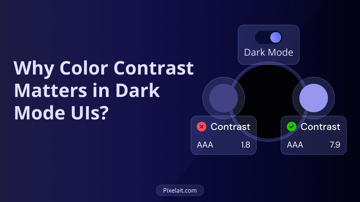
Low contrast can make text difficult to read, leading to eye strain and accessibility issues. Below is an example of poor contrast, where the text blends too much with the background, reducing readability.

- Overly saturated accent colors – Bright colors on a dark background can vibrate visually, reducing clarity.
For a deeper understanding of these issues, check out Learn how to implement the WCAG recommendations on color contrast by Uxcel.
Best Practices for Dark Mode Contrast
To ensure readability and accessibility, designers should:
- Use dark grays instead of pure black to reduce eye strain.
- Choose high-contrast text colors that meet WCAG standards.
- Test contrast levels with tools like Pixelait’s Contrast Checker in Figma.
- Avoid harshly saturated colors and opt for muted tones.
Dark mode can improve user experience, but proper contrast is key to readability. The following example demonstrates different contrast levels in dark mode and their impact on text visibility

If you’re crafting UI designs, our blog on Key Considerations When Crafting User Interface Design provides additional insights.
Finding the Right Colors for Dark Mode
Selecting the best colors for dark mode requires balancing aesthetics and functionality. Dev.to’s guide on the best color for dark mode explores which shades work best. If you need to extract colors from an image for inspiration, our guide on 6 Best Tools to Extract Colors from an Image can help.
Final Thoughts
Dark mode is not a one-size-fits-all solution for accessibility. Without proper color contrast, it can still cause readability issues. Making sure your design meets WCAG guidelines and testing contrast with tools like our Figma Contrast Checker will create a better experience for all users. If you’re using Figma, our guide on Check Contrast Easily in Figma with Pixelait walks you through the process.
By prioritizing color contrast in dark mode, designers can create visually appealing, accessible, and user-friendly interfaces for everyone.

