As UI/UX designers, we obsess over every pixel. We check contrast ratios, optimize visual hierarchy, and test readability across devices. We know that poor design costs conversions, erodes trust, and damages brand perception. Yet when it comes to our own resumes, we abandon everything we know. That’s the irony. We wouldn’t ship a product with 3:1 contrast ratios, inconsistent spacing, or unclear calls to action. But we send resumes with exactly these flaws to recruiters every single day. It’s time to change that. And it starts with treating design resume as seriously as any other design project you take on.
Your Resume Is a User Interface
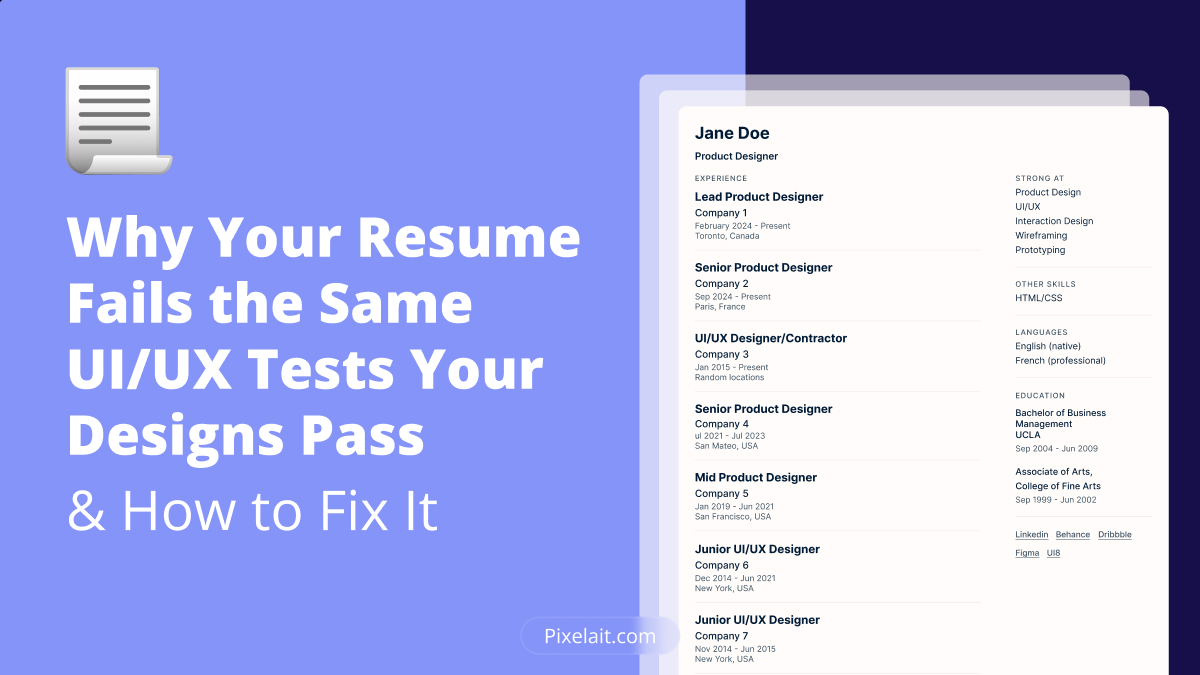
Think of your resume as a critical interface with one specific task flow.
In this case, the user is a recruiter or hiring manager. Their goal is to decide quickly whether you merit further consideration. In most cases, they are scanning 50 to 200 resumes in a single session, sometimes on a mobile device. Because of that, they make the decision in 6 to 8 seconds.
The friction points are clear, poor visual hierarchy, low readability, cognitive overload, and an unclear value proposition.
Simply put, this is a UX problem. Unfortunately, most resumes fail it badly.
When we run designer resumes through the same automated audits we use for interfaces, checking accessibility, visual consistency, readability, and information architecture, the failure rate is striking. In many cases, poor resume design is the root cause.
Here is why.
The Five Biggest UI/UX Failures in Designer Resumes
1. Insufficient Contrast Ratios
You know text should meet WCAG AA standards. That means a minimum 4.5:1 ratio for normal text and 3:1 for large text. Naturally, you check this on every client project.
However, designer resumes routinely break these rules. For instance, light gray text on white backgrounds often sits at a 2.8:1 ratio. In the same way, colored section headers can drop as low as 2.5:1. Meanwhile, metadata in pale tones fails AA standards entirely.
As a result, recruiters struggle to read your resume, especially on bright screens or mobile devices. Because of this, critical information about your skills and experience simply disappears. If you want to go deeper into visual comfort and readability, check out our guide on how to choose website colors that are not eye-irritating.
Fortunately, the fix is straightforward. Check every color combination with a contrast tool. Then aim for WCAG AA at minimum and AAA where possible. After all, good resume design starts with text that people can actually read.
2. Broken Visual Hierarchy
In interface design, we use size, weight, spacing, and color to guide users through content in order of importance. As a result, good hierarchy reduces cognitive load and improves task completion.
Even so, designer resumes often ignore this completely. In many cases, section headers are barely distinguishable from body text. Likewise, job titles, company names, and dates receive identical visual treatment. When everything carries equal weight, nothing stands out.
Because of that, recruiters cannot easily tell the difference between your senior role at a top agency and your college internship. Instead, it all blurs together.
To fix this, apply the same hierarchy rules you use in any UI. Make primary information, your current role and key skills, the largest and boldest. Then give secondary information like company names and dates a medium weight. Finally, keep tertiary details like specific tools slightly smaller.
3. Inconsistent Spacing
You use spacing systems in your design work. You also know that inconsistent spacing creates visual chaos and signals poor quality.
Still, many designer resumes have random spacing throughout. You may see ten pixels here, fourteen there, and seven somewhere else. On top of that, there is often no consistent margin system and varying line heights between similar elements.
Recruiters notice this, even if they cannot name it directly. As a result, inconsistent spacing communicates carelessness. In other words, it tells them this designer does not pay attention to detail. Strong resume design requires the same spacing discipline you bring to any interface. The same principle applies to whitespace too, and you can read more about it in our article The Power of Whitespace in UI: Why Less Often Means More?
A better approach is simple. Set a base unit of 8px or 4px and apply it consistently from top to bottom.
4. Readability Violations
We all know the rules. Optimal line length is 50 to 75 characters. Body text should sit at a line height of 1.4 to 1.6. Font sizes should be at least 11 to 12pt. In addition, whitespace matters.
Nevertheless, designer resumes routinely break every one of these. Full-width paragraphs stretch to 120+ characters. At the same time, line heights are squeezed to 1.0 or 1.2. In some cases, body text shrinks to 9pt just to fit more onto a single page.
As expected, the result is a resume that is exhausting to read. Consequently, recruiters skim past your best accomplishments because the text is too dense to parse quickly.
Instead, treat your resume design like a content-heavy interface. Optimize line length, use appropriate line height, and give your content room to breathe.
5. Unclear Calls to Action
Every interface has a primary action. Great design makes that action obvious.
For your resume, the primary CTA is simple, Contact me. However, most designer resumes bury contact information in tiny text. They also give equal visual weight to email, phone, LinkedIn, portfolio, and location. As a result, no single method stands out, and nothing guides the recruiter toward the next step.
The recruiter finds you interesting, but then cannot figure out how to reach you. So they move on.
A stronger solution is to make your preferred contact method visually prominent. It should be scannable within the first second. Above all, remove every possible point of friction from contact this candidate.
What an Automated Resume Audit Would Find
We build tools to audit UI designs automatically. So what if we applied that same framework to resume design? At Pixelait, we focus on helping teams catch UI issues earlier through automated design checks and clearer visual feedback.
A proper audit would check four key areas.
Accessibility
Does all text meet WCAG AA contrast minimums? Is color the only way information is differentiated? Is text selectable, or is it trapped in an image?
Visual consistency
Does spacing follow a consistent system? Do similar elements share the same styling? Are margins and alignment precise throughout?
Readability
Does line length stay within the 50 to 75 character range? Is line height at least 1.4? Is body text at least 11pt? Is there enough whitespace between sections?
Information architecture
Are there at least three distinct levels of visual emphasis? Can a recruiter identify key information in under 8 seconds? Does the content flow logically from most to least important?
Most designer resumes would fail this audit. Not because the designers lack skill, but because they do not apply their professional standards to their own documents.
A Practical Workflow for Optimizing Your Resume
Phase 1: Content Audit
Start with content before you touch the resume design. Ask yourself the same questions you would ask about interface copy. Is every word necessary? Are your accomplishments quantified with real numbers? Does each bullet point add genuine value?
If not, cut anything that does not earn its place.
Phase 2: Information Architecture
Next, structure your content the way you would structure an interface. What should a recruiter see in the first three seconds? What is above the fold? How should information be grouped? What is the logical reading order?
Answer these questions before you open a design tool.
Phase 3: Visual Design
Now apply your design process. Set a spacing system. Define a clear typographic scale with at least three levels of emphasis. Choose readable fonts. Check every contrast ratio. Then align everything precisely.
At this stage, design the document with the same care you would give a client deliverable.
Phase 4: Validate
After that, run the same checks you would run on any UI. Test contrast ratios with an accessibility tool. Check line length and readability scores. Also confirm the file exports correctly and parses cleanly through ATS systems.
Phase 5: Tailor for Each Role
Here’s where it gets interesting. You wouldn’t use the same interface design for a meditation app and a stock trading platform. Similarly, you shouldn’t use the same resume for every application.
This is where resume tailoring tools like CVnomist become valuable—they help you strategically emphasize different aspects of your experience based on the specific opportunity, without compromising your design system or starting from scratch each time.
The best approach combines consistent design foundations with content optimization for each use case:
- Design system: Remains consistent (spacing, typography, colors, hierarchy)
- Content emphasis: Adapts based on opportunity (which projects to highlight, which skills to emphasize)
- Value proposition: Tailored to specific role requirements (product design vs. design systems vs. branding)
This is exactly how we build design systems—consistent foundation, flexible application.That is design systems thinking applied to your career.
Do Not Forget Mobile
Many recruiters review resumes on mobile during commutes or between meetings. Unfortunately, most designer resumes completely fall apart on small screens.
Because of that, apply mobile-first thinking. Make contact information tappable. Keep body text at 12pt minimum. Avoid multi-column layouts that collapse into an unreadable mess. Also make sure the most important information appears without scrolling.
Then test your resume on an actual phone. If you have to pinch to zoom, your resume design needs a rethink.
The ATS Constraint Is a Design Problem
You want to create something visually impressive. However, many companies use Applicant Tracking Systems that struggle with complex layouts.
In reality, this is a constraints-based design challenge, exactly the kind designers solve every day.
Think of it as progressive enhancement. Start with a clean, structured base that ATS systems can parse reliably. Then layer on thoughtful typography, strategic color, and consistent spacing for human readers. Finally, add subtle design touches that demonstrate taste without breaking functionality.
That way, every layer builds on the one before it without compromising it.
Common Resume Design Mistakes
The Design Flex Resume uses custom illustrations, complex graphics, and unusual layouts to show off design skill. Unfortunately, it sacrifices readability and ATS compatibility in the process. A beautiful, functional resume design demonstrates your understanding of constraints better than design gymnastics.
The Over-Minimalist Resume strips so much away that critical information becomes hard to find. It may have lots of whitespace, tiny text, and ultra-light typography. However, minimalism should serve function, not aesthetics. Recruiters still need the information.
The Tool Dump Resume lists 40+ software tools with equal weight. As expected, this creates cognitive overload. Instead, group and prioritize your skills the way you would organize a feature list. Show depth in your core tools and simply acknowledge familiarity with the rest.
The Untouched Template Resume looks identical to thousands of others, despite coming from a designer. Still, you can create something distinctive and personal within ATS-compatible formats. You just need to take the time to do it.
The Measurable Impact
When designers apply real UI/UX standards to their resume design, the results are concrete.
Well-designed resumes with clear hierarchy and scannable content increase interview request rates by 30 to 40 percent compared to poorly designed equivalents with the same content.
Likewise, recruiters spend an average of 8 seconds on a typical resume, but 12 to 15 seconds on a well-designed one. In this case, the design does what good design always does, it guides attention and makes information easy to extract.
Clear value propositions and tailored content also lead to more relevant opportunities, not just more volume. As a result, you get contacted about roles you actually want.
Most importantly, when your resume design demonstrates the same attention to detail as your client work, it reinforces your capabilities before the interview even begins.
Treat Your Resume Like a Product
You iterate on designs based on data and feedback. Therefore, do the same with your resume.
Track your application-to-response rate. Notice which types of opportunities you are being contacted about. Test different approaches and see what performs better.
At the same time, ask recruiters what stood out, and what did not. Update your skills as you grow. Add recent projects. Then adjust your positioning as the market shifts.
Your resume is a living product. Because of that, it needs the same ongoing optimization as any interface you ship.
The Standard You Should Hold
If you would not ship an interface with contrast ratios below WCAG AA, inconsistent spacing, poor visual hierarchy, difficult-to-read typography, or unclear calls to action, then you should not send a resume with those same problems.
The standards you apply professionally should apply personally.
After all, your career documents determine which opportunities you get to pursue, which projects you get to work on, and ultimately, the direction your career takes.
Your resume design is your most important design project. Give it your best work.
About the Author

Youssef Ayyad, CVnomist.com
With two years as an Account Manager at two leading ATS providers, Youssef worked alongside recruiters daily and gained firsthand insight into how hiring technology really works. He now helps job seekers navigate the increasingly automated job market, knowing exactly how resumes are filtered, ranked, and reviewed, and what it takes to get in front of real decision-makers.

